How did you use media technologies in the construction and research, planning and evaluation stages?

When it came to media technology and showing the work I had done, I used a blog site called blogger.com. This allowed me to write posts and share my research, planning and the final product on to my very own blog. By doing this, it allows other people who have a blogger account to view my blog and leave comments if they want to. I was able to look back over the previous work i had done and I could also change anything that I thought needed improving. I decided to put my video on social sites such as YouTube and Facebook, this allowed me to share my video and work with people around the world and also of my own age, particularly my target audience. 


When I started my research I relied on media technology a lot especially the internet as Google was a very reliable source. I also looked across YouTube for other A2 music videos, to get an idea and to see how professional other peoples work looked at this level. I also used the internet for websites such as Facebook, to share my video socially for audience feedback. Another website i used was slideshare, here i uploaded a powerpoint presentation onto my account on the website, this was to pitch my video to the audience. I also used a useful website called weebly, this was where I made the website for my band. I used the classic pen and paper to plan for my music video and also took lots of pictures of evidence of my research and planning and uploaded them to my blog. However I decided not to make any storyboards due to the fact I can't draw and also because I didn't really have a real narrative structure in my music video. Also because I was the only person working on my video, I knew what ideas I had in mind and I didn't need to share them.


Whilst out filming my video I used many media technologies that helped me to achieve the high standard of video I was aiming for. I took pictures of 'behind the scenes' with my iPhone 5, this is very high technology with a good camera. When it came to actually recording the footage and taking photos for the music video I used a Panasonic Lumix DMC-FZ10EB camera, this is a very professional and good quality camera that took decent footage and images for my video. Hardware within media technology was evident in the editing process as I used my MacBook Air which has a top editing software that many professionals use called Final Cut Pro X on it. This allowed me to edit at a high standard and use many techniques that others who don't have this software wouldn't be able to use. When I started the editing process I imported my chosen song as an mp3 format into Final Cut, I had already downloaded the song previously. Again this shows how I have used many different types of media technologies to help me research, plan, construct and evaluate my music video.


Overall, when it comes to evaluating my work the media technology i used the most was blogger.com. I used this website from start to finish whilst working on my product, this was to show every aspect that I did to create my final music video. From the research of the band and theorists, to planning with screenshots and finally audience feedback etc. It would have been impossible to even attempt this project if it wasn't for the media technologies we have today.

What have you learned from your audience feedback?

Once i had completely finished my music video, I uploaded it onto YouTube to gather some audience feedback and so that people around the world could access it and view it. Although YouTube is the most popular video sharing site around the world, not many people knew that my video had been uploaded, therefore i looked at other ways to share my video so I would be able to get some feedback. The first thought that popped into my head was social networking sites, as these are also used around the world. The most popular social networking sites are Facebook and Twitter as many people use these. Therefore I thought it would be a good idea to post my video through a status on Facebook so that my friends and family could give me some feedback. Although I do have a Twitter account, I rarely use it, therefore I didn't want to post my video on the site. I knew that this would reduce the amount of possible feedback that I could of received but I was more than happy with just putting it on Facebook. When I posted it onto Facebook, I was happy to welcome any positive or negative feedback.


I knew that if people watched my music video and liked it, they would press the 'like' button available to them. This was clear as a number of people were pressing the 'like' button and also leaving comments for me to see. As more and more people came across my video on Facebook, the more the views were going up on Youtube. In a day, before my video was posted on to Facebook, it had received 10 views. When I put it onto Facebook, in less than a week it had 74 views. The comments on Facebook were very positive, one person expressed which particular bit of my video they liked the most, I thought this was nice of them to do that. Others had high hopes for me and spoke about future job careers in the media, which I thought was very positive. As well as the audience feedback I have learn a lot from social interaction within the media from sites such as YouTube and Facebook.


From looking back over my audience feedback I have learnt that it plays a big part in knowing what people think and how media is consumed today. For my video the feedback showed that it was success as i never received any negative feedback. This is what I was hoping for as I had spent so long creating it and the ancillary tasks to go with it. I was overall happy with the response and felt proud of myself for completing everything and getting the response i had hoped for. 


How effective is the combination of your main product and ancillary texts?

When I began to do some research into my ancillary tasks, I discovered that they would all need to link to each other and my video. This was so that the audience can recognise the band and the particular theme running throughout the ancillaries. I wanted to make sure that all of my ancillaries as well as my main music video were all consistent and looked similar. If they are consistent then the fans would always know what to look out fir and may even help us to gather more fans. I think that, looking over my digipak, magazine advert and website I achieved this goal I was aiming for. 


I think that I have worked hard to link each ancillary task to my main product, making sure they look consistent and relate to to each other. Both the digipak and magazine advert both have similar images on and the same font and text. As I have used two images that are alike the audience will now recognise that particular band, their video and the media products that go with them. For my website I have also chosen a picture for the background that relates to the other two ancillary tasks as well. Also on my digipak and magazine advert and also in my music video, I have used the same font throughout my media products. This again is for consistency and so that they are all similar and recognisable. All of my ancillary tasks have recognisable images on them that the audience will remember from watching my video. They will be able to see the link between my main product and my three ancillary tasks, hopefully leading to more sales and fans, which is what I was aiming for. 


Each different ancillary that i have created from scratch, allows the audience to see that each particular media product and my video all link together to help develop the band further. I have carefully considered the audience when creating my ancillaries, this was to make sure that each product, even my music video linked together and also advertised the band in a positive way, helping them to sell more songs and the album.


Overall I think that the combination of all of my ancillary tasks and the actual music video itself is very effective as they all relate to each other. This makes them more noticeable to the audience and more so the fans, as they will be able to link each product to the main video, knowing that it is all by the same band. As more and more people notice this, more people will see and recognise the magazine advert, website and album cover, and will want to watch the video, leading to them buying the album. 

In what ways does your media product use, develop or challenge forms and conventions of real media products?

As my music video was based on a concept theme and it wasn't a stereotypical pop song by Rihanna or Beyonce etc, I wanted to make sure that my music video didn't follow the same conventions as they do. As I chose a British indie male band, I knew straight away that I didn't want a performance based video. I thought that this would look unprofessional and I knew i would't be able to pull it off as I obviously didn't have the real artist to perform in it. 

Many music videos today are based on performance and the artist is almost certainly in the video, whether they're singing or not. As i knew this was a typical convention when it comes to creating music videos I knew i wanted to avoid this as I wanted to be different. When I had chosen my song I decided to research the band and the specific genre of indie. This was so that I knew what conventions to apply or even consider to put in my music video. I found that indie music videos are more narrative based, however also performance as they show clips of the artist in the video. I decided that I wanted to challenge the usual forms and conventions of indie music videos. This let me incorporate a non linear narrative into my video, which proved to work in the end. I chose to use a variety of different types of camera shots and angles and also a wide range of editing skills like, slow and fast motion and reversing the video. These were all used to create the concept based convention I wanted to achieve in my video. As you can see I have made a distinct difference between the conventions of music video and the traditional band's music video. 


When it came to creating my digipak and magazine advert I wanted to input some of the normal forms and conventions  in media products today. I decided that I wanted my album and cover and magazine advert to stand out, as they would obviously need to attract attention in a shop, billboard etc. this is so people would buy it. I chose to use images that I had took from filming my video and change them into black and white. I thought that this would help them both to stand out as not many other albums or magazine adverts are just black and white. I also thought that by using the same images that I included in my music video would attract the audience more, because if they have seen my video they will recognise my album or magazine advert. I also thought it was a good idea to get specific fonts off specialised font websites rather than the usual 'Arial' off Microsoft Word. This would make my album and advert unique from other media products and help them to stand out in shops. 


I followed the same path when I came to make my website for the band. I wanted to use the forms and conventions that most music products use today but with my own twist on it. After researching indie bands and looking at their websites, I came to realise that there were four main pages that I needed to put on my website in order to follow the typical conventions. These were the home page which told the audience a bit about the band, an images page that had pictures of the band and the video, a video page with their recent video/song releases and finally a contact page which allows the audience to get in touch with the band. However for me to develop further and slightly change the forms of media products today, I thought it would be a good idea to make the pages stand out. I did this by using a particular image that I also used in my music video, again changing it to black and white and inserting it on every page as a background. This links to my other ancillary tasks, the digipak and magazine advert which the audience will recognise if they have seen my music video.


Pitch

Social Networks

Social networks have grown more and more in recent years with many different people using them for many different reasons. Uses such as communication, sharing videos and images, music and advertising are all popular. Many artists use social networking sites to inform their fans of any upcoming events or releases and also to share new music, images or videos. The most popular social network site that is used today is Facebook. Facebook is used by many people around the whole world for many reasons including keeping up to date and interacting or liking the artists official page. 

Below is a screen shot of Everything Everything's official Facebook page. At the top of the page they are promoting their latest album and the three popular released songs off it as well as the album cover. It also shows three buttons where a user can like, listen or message the band. There are also buttons where you can view their photos, events, buy tickets and mail them. This page also shows the direct statuses that the band writes themselves to their fans.


Below is the bands Twitter page where again they have advertised their newly released album. On here you can follow the band which will then inform you of every picture, video and post they put on their page. 


Audience Feedback

Facebook 

When I uploaded my video onto Youtube I decided to put it on to Facebook the day after. This was so that I could get audience feedback from friends and relatives on the social network website. Another reason why I put it on Facebook is because not many people would know to go on YouTube to watch it and also to leave feedback. When I first posted the video onto the site I kept an open mind and welcomed both negative and positive feedback. I felt that the feedback that i received on Facebook was important to let me know what the audience really thought. Overall I am very pleased with the feedback that was left on my post as it was all very positive. 


I posted a status and shared my video on to Facebook the day after I put it on YouTube. As you can see in less than a week, 10 people have liked my status and four have commented. One person commented on which particular bit of the video they liked the most, it was nice to see that someone had a favourite bit in my video. Others commented on how good they thought my video is and how I or my video could be successful in the future. This was a nice reaction from my friends and family, helping me to feel even more successful with my finished product. Below is a screenshot of the YouTube page of my video. Here you can see that in less than a week I have received 74 views. Since putting my video on it has gained more views considerably which I am very pleased with.


Uploading to YouTube

After completing my music video I decided to upload it on to the video sharing website YouTube. I chose this site in particular because it is the most popular one around the world, therefore it would give my video a lot of exposure. When I first exported my video I had a lot of trouble putting it onto YouTube as the file format needing changing and it needed to be compressed. I finally converted it from an MOV to an FLV so that it would upload quickly and would still be good quality on YouTube. When I uploaded the video, I changed the name of it and added a description. I also added particular words as tags so that when people search with specific words such as 'cough' or 'A2' my video would come up. At the moment my music video has 10 views on YouTube as i only uploaded it late last night. I am going to put a link to the video on my Facebook so that it can get lots of exposure and so that more people can leave me some feedback on it. 


Final Music Video


Editing my Music Video

My original plan was to get all of the filming out of the way first and then begin to edit it and put it together. However half way through the filming process I thought it would be best to start putting the video together to get a sense of what it was going to look like. To edit my music video I thought it would be best to use my Apple Macbook Air as it is recently new. It also has Final Cut Pro X on it, which is one of the top editing softwares for Apple when creating media. These were both superb assets to have when I was editing my music video, as they were of a high standard, reliable and easy to use for myself.


When I came to edit my music video, I realised that I hadn't got enough footage to last the whole 3:42 of the song. This is when I had to do some more filming and decided to do it in my back garden and the little woods. When I had finally got all of the footage I needed I worked hard on the editing to get it exactly how I wanted it to look. All together I spent about three days editing my video, until I finally completed it to my high standard. 

As my music video is concept based and doesn't have a narrative storyline it was fairly easy to edit. I wanted Teagan to look innocent and sweet on certain parts and then suddenly change to an evil side of her. This was the only plan that I wanted to follow throughout my video, which I did. I most certainly wanted my video to be edited to the beat of the song, as this is why I chose this particular song at the beginning of the project. It has a cutting and edgy, fast beat to it which was effective to edit to with the more sinister footage of Teagan. 

Mainly at the start of my music video and on a few other parts of the chorus, I have added text onto the screen. At the very beginning of the video the word 'cough' appears multiple times to the word being said in the song. I chose to do this because it looked very effective and also because Everything Everything did a similar text in their own video for the song. Also on certain strong words in the chorus I used the same text as I thought it was bold and was edgy. The font I used was 'sacrificial' off dafonts.com, which I have used for the majority of my ancillary tasks. This is so that all of my promotions for the band, as well as their own video are consistent throughout.


Everything Everythings 'cough' text

My Music Video 'cough' text

Whilst editing my video I decided the more effects there were, the better. I wanted Teagan to look cute in certain parts and scary in others, therefore I used many effects on my footage that Final Cut Pro X had to offer. For the innocent images and videos I put them in slow motion or just added a softer tone onto them. This made them look lighter in colour and appearance to the opposite footage. For the sinister side of Teagan I used dark and shadowed effects and filters. I also reversed the clips and fast forwarded them to make them look quick and scary for the viewer. If there were still images then I would add on certain effects that make them look like they are moving such as 'bad tv' or 'projector'. All of these effects, filters and speed differences were added onto the clips which created the music video I wanted to achieve. 

For the chorus of my video I decided to repeat the videos and images shown, changing them slightly. I thought this was a good idea as the lyrics to the chorus are obviously repeated throughout the song. Every time the chorus said the same lyrics, my video would show the same footage. However on the second time its repeated I have changed the images that flash up. This is so that the viewer can see other footage and it changes it slightly when repeated. 

As I was creating a music video I wouldn't of needed the diegetic sound that was on each single video I had taken. Therefore I detached the audio that was on the videos and deleted them, leaving just the non-diegetic sound of the music track that was over the top. This reduced any unwanted background noise that wasn't needed and that would make my music video look and sound unprofessional. 


Filming My Music Video

Cast and Crew

I asked my eight year old sister, Teagan to be in my music video as I wanted a young girl to be the main focus. When she agreed to help me I knew that I didn't want anybody else in my video as it wouldn't follow the theme I had in mind. I didnt even want the public walking by as I thought this would distract the viewer from the main focus of Teagan. I didn't want to star in my own video as I knew it would be impossible with me directing, filming and editing. Although I filmed all of the footage myself I did have a helping hand from my other sister and my mum. This was due to me not being able to film Teagan and also help her with props and costume. A few pictures i took that I have used for my ancillary tasks are when I got my mum and sister involved. Below is an image of Teagan and her hair is blowing about, here I took the pictures whilst my mum and sister got multiple hair dryers and crouched beneath Teagan to blow her hair up in the air. These photos turned out to be very effective and important, so I am glad I got the extra help from my family.


Time

It took me around three weeks all together to film my video, with pauses in between due to doing other work, availability of me and Teagan and also the weather. Although things got in the way and stopped me filming at times I still pushed ahead to get the appropriate footage I wanted. 

Filming the Video

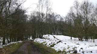
On the first day of filming it was snowing, however I decided this would be a good effect on the images and videos I could take. I drove me and my sister to Cannock Chase in the morning with her all ready in her costume. I made sure that I had all of the necessary equipment with me to film her. I spent about an hour taking pictures and filming her in the snow, however we then decided that it was too cold to carry on and i felt that I had enough footage of what I wanted in the snow anyway. 


The day after, as the snow was still there, I decided to take some pictures inside of Teagan standing against a plain wall as the backdrop. This was a good day to film due to the weather and the footage that I needed to capture. I took a lot of photos on this day with the help of my mum and sister, with the ancillary tasks in mind. 

On the next day of filming it was nearly a week ahead, as i was waiting for the majority of the snow to melt away. Again we headed up to Cannock Chase, around the same area of woodland with the right equipment, props and costume. Although there was still snow, a lot of it had melted away, therefore it wasn't as cold and we could film for a bit longer than the last time. We took more images and videos until I decided I had enough of the footage I was after. 


The next day I filmed, we travelled to Burton to film inside my nans house as she has a narrow landing that I specifically wanted in my music video. I brought all of the appropriate equipment and costumes with me and set it all up upstairs. First I filmed down the landing which I had in mind for quite a while. However I then decided to film in one of my nans bedrooms as it is Teagan's and is pink and innocent looking. I got her to play with the toys and rocking chair in there to portray her as a sweet young girl.

On the final day of filming I decided to film Teagan in our back garden and also the little woods behind our house. I thought these were nice locations that suited my music video and they were also different scenery for the viewer to look at. I took pictures and filmed her in both areas until I knew I had enough footage for the whole of my video. 


Ancillary Task - Website

Another ancillary task was to create a website for my chosen artist and their upcoming album. I chose to use a free service called weebly.com, this was because it was free and easy to use and also included everything that I wanted to put on my website. For the main design of my website I chose a specific style and colour background that I thought suited my them and image in mind. When it came to the text, unfortunately I couldn't use the same font from dafonts.com as I have used on everything else as it wasn't on the website. However I did find a suitable text that went well with my chosen design and what I wanted my website to look like. After choosing my font and lay out, I decided to insert a picture of Teagan to be shown on every page so that all of the website would be consistent. 


A website can give an audience a lot more details about an artist and their album, therefore I thought this task was an important one to do. Whilst making my website I kept on looking at Everything Everything's official website to get ideas of what to include on my own. Below is the link to the bands official website.

About the Band

On the home page I wanted to keep it simple and just tell the viewer the background of the band. I inserted a picture of the band so that the viewer can acknowledge what they look like.   I then got information about the band from wikipedia and put it on my web page 'About the Band'. Also in the top right hand corner of the website there are two popular symbols of Facebook and Twitter, these are links to the bands official social network pages so that the audience can like and follow the band. 

Gallery

On the next page I decided to make a gallery of the band and the music video I had made. I inserted a few pictures of the actual band and their album cover, followed by images from my music video. These are interesting for the audience to look at as they can see different pictures of the band and video and may influence them to buy the album.

Videos

I decided to make a page specifically for the artists videos for the audience to view. Here I have put on the three latest official videos from Everything Everything. The first obviously being 'Cough Cough' the next being their second release from their album 'Kemosabe' and the last is their latest release off of the album 'Duet. I have also added my own music video onto this web page.

Contact Us

This web page allows the viewer to contact the band. The audience can type their first and last name and also type in their email address for the band to send them promotions, deals and news and also to possibly contact them back. The audience can also leave a comment to the band, for fans to give feedback or express their love of the music etc. 


Below is the link to my website that I have made. 


Ancillary Task - Magazine Advertisement

Another ancillary task was to create a magazine advertisement which I also chose to do. For this I used an image I had taken for my video and edited it so it was suitable to be advertised in a magazine. First I put the image in black and white and also put a paint strokes filter over it, this is very similar to the digipak album I created as I wanted all of my ancillary tasks to look consistent. I chose to put these effects on as it made Teagan look chilling and creepy as she is in parts of the video and on the album cover. The magazine image is very similar to the front cover of the album, this again is so that the bands promotions look consistent and the audience knows from the image that its that particular band. I then added on the text of the band and album names, using the fonts from dafonts.com. This again was so that all of my ancillary tasks and the bands merchandise was consistent throughout. Further on I added on two reviews which I got off metacritic.com, one from Q magazine and the other from musicOMH.com. I thought that putting reviews on my magazine advertisement would be very effective for the reader as they can see what professionals thought of the album, something that might make the want to buy it more. Finally I added on my ancillary website URL that I made, the reason for this was to mazimise the potential audience that would see the promotion, visit the website and then buy the album.


Ancillary Task - Final Digipak

As I did each part of my album separate, I was excited to see what they all looked like together. I knew what I had in mind and that it would be the way I wanted it to look but putting it all together makes me pleased with what the final outcome is. 


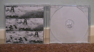
As you can see I have put the front, back and middle together to create my album. I have also  decided to print them off and insert them into a physical CD case to see what it would look like on the shelves. 


Middle of Album Cover

Middle Cover


I chose to use three images that I had taken for my video for the inside of my album, this was so that there was a link between my video and my album all together. I chose these certain images because they were disturbing but catchy and looked sinister which is what I wanted to portray through Teagan again. Again you can see that i have edited all three images and put them in black and white, this is so that they all look similar to each other and the rest of the album cover. I decided instead of using one image I would change it up and use three different ones that look the same. This is so that the audience can see multiple pictures and not just one on every different page. 


I edited the images in Microsoft Word by changing them to black and white and then adding a chalk sketch filter over it, this made them look more shadowed and dark as well as sketchy.  I also changed the dimensions of the images so that it would be the same as an album cover and cropped them all so that Teagan would be in different positions in each image. I then put all three in a column together and grouped them so that they would be one picture. I decided not to put any text on the middle cover as I thought it wasn't necessary, to me, the pictures say enough.


Back of Album Cover

Back Cover


For the back cover I chose an image that I had taken for my music video, again because it would link between my video and the album. I chose this because it looked chilling and creepy, referring to the twins in the shining. Although this was going to be the back cover I still wanted to make it eye catching so that the audience will remember it. If the front cover catches their eye they will probably pick it up and turn it over to look at the back, therefore I wanted an edgy image that will stay with them. I have edited the image as you can see and put text onto it. I chose an image which has a lot of free space around it, a perfect canvas for more text than the front cover i.e. the song list and artists name. 


I edited the image in Microsoft Word again as this is an easy way to do it, however the latest version has lots of effects on it. I changed the image to black and white to match the rest of my digipak and added a paint strokes filter over it, this made it look blurred and creepy just as I wanted it to. I then added the text of the artists name and the thirteen different song names, again I used the same unique fonts from dafonts.com and the same font size, this was so that my digipak would all look the same and would be consistent throughout. I changed the dimensions of the image, again so that it would be the same as an album.


Front of Album Cover

Front Cover

I chose to use an image that I had taken for my video as my album cover, this was so that there was a link between my video and the front cover of the album. When I was taking these photos, I originally hadn't planned for one of them to be my album cover, however I knew straight away after taking them that I wanted to use one of them as they were eye catching. I chose this certain image because it was edgy and looked sinister which is what I wanted to portray through Teagan. I also chose this image as it had a lot of free space around the edge, giving a great canvas for the text to sit on. As you can see I have edited the image and added text onto it by using effects and special fonts. I decided that I not only wanted my album cover to be in black and white but also the whole of the digipak. I thought this would look effective and catch the audiences eye when going to buy an album. It also looked better in black and white because it represents Teagan's evil side like in the video. 


I edited the image in Microsoft Word by changing it to black and white and then adding a film grain filter over it, this made it look more shadowed and dark as well as fuzzy. I then added the appropriate text of the band and album name and I thought it would be better to get some unique fonts off a website called dafonts.com. I chose 'Urban Jungle' for the bands name and 'Sacrificial' for the album name. I decided to choose these two fonts as they were edgy and bold, in particular I chose 'Sacrificial' for the words 'cough cough' as this font looks spilled and splattered as it would look if somebody coughed it up. I also changed the dimensions of the image so that it would be the same as an album cover.


Album Cover Research

For preparation of the ancillary tasks, I first chose to look at album covers to see what different styles there were so that I could get an idea of what my digipak could look like. A digipak is the packaging of a CD, this is what the fans see when going to buy the album, therefore it is important for the artist to make it attractive so that it catches the eye of the audience. Digipak's include the front cover, which the audience most likely will see first, the back cover which often has the list of the song names on it and the middle when it is opened. The middle of a digipak can vary with different artists, some may be plain and just contain the actual CD itself, others may extend out to reveal images or text and others may include a booklet with either images or even sometimes the lyrics to the songs on that specific album.

Most famous pop artists have their own face on the cover of their album as this is simple, cheap and the audience will know the artist just by looking at the cover. For example some that I found on the internet are Beyonce, Lady Gaga, Tinie Tempah and David Guetta, as you can see it is both male and female artists that establish their face on their album covers. 


However the band that I have chosen aren't extremely famous and they are not in the pop genre. Although Everything Everything's latest album cover has their four faces on I am not going to follow that path as I want to change it up a little. Instead I am going to use an image from my music video, possibly of Teagan to go on the front cover. This makes mine different as it is not the artist being shown but that it has a reference to the music video that I have made.


Location

The main location that I used throughout my music video was Cannock Chase, this was because i thought it was a great open landscape that suited my idea well. I wanted a vast wooded area where there were no houses or people to be seen as I just wanted my sister Teagan to be alone in the video. This would create the creepy effect of a young girl alone in the woods that i wanted to achieve. During the time of filming it started snowing, this could of been a real problem due to continuity, as the snow would be in certain shots and then melted away in others. However as the snow kept on falling I decided to shoot some of my video on the chase in the snow. I thought this would put a nice effect of scary snowy images of the woodland in my music video. 


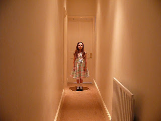
For the other location I filmed in a child's bedroom and the upstairs landing at my nans house. I chose to film here as I wanted a long narrow landing for Teagan to walk up, so that it could look similar to 'The Shining'. I wanted a contrast of her looking young and innocent in the pink child's bedroom and then looking more evil and sinister down the narrow landing as it is in 'The Shining'. I also liked the lighting at my nans house as it was soft in the bedroom which matches the sweet young girl and then bold spotlights shining down onto the girl as she turns more evil.


The final location that I used was my back garden at home and the little woods that run behind it. I chose to film here because it was a bit different to the other locations and it would let the viewer see a different piece of scenery. I didn't originally plan to film here but when I started to edit my video I realised I hadn't got enough footage to last the whole length of the song. On the other hand this was a close by and handy location that worked well and suited my theme for my music video.