Back Cover
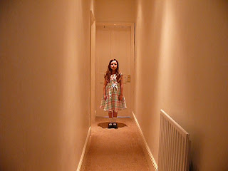
For the back cover I chose an image that I had taken for my music video, again because it would link between my video and the album. I chose this because it looked chilling and creepy, referring to the twins in the shining. Although this was going to be the back cover I still wanted to make it eye catching so that the audience will remember it. If the front cover catches their eye they will probably pick it up and turn it over to look at the back, therefore I wanted an edgy image that will stay with them. I have edited the image as you can see and put text onto it. I chose an image which has a lot of free space around it, a perfect canvas for more text than the front cover i.e. the song list and artists name.
I edited the image in Microsoft Word again as this is an easy way to do it, however the latest version has lots of effects on it. I changed the image to black and white to match the rest of my digipak and added a paint strokes filter over it, this made it look blurred and creepy just as I wanted it to. I then added the text of the artists name and the thirteen different song names, again I used the same unique fonts from dafonts.com and the same font size, this was so that my digipak would all look the same and would be consistent throughout. I changed the dimensions of the image, again so that it would be the same as an album.


No comments:
Post a Comment